 Summary: Having a responsive website is essential not only for user experience, but it also saves you a lot of money (you don’t have to create a separate mobile website), is great for SEO, and is simply the industry standard.
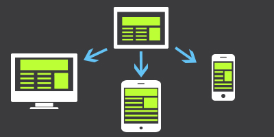
Is your website responsive? If not, it should be. Responsive website design means that your website scales depending on the device that is being used to view your site. For example, if you pull your website up on a mobile phone, the website adjusts its shape to fit your monitor. The same applies to a tablet, or a big, widescreen monitor.
Below are three reasons why your website needs to be responsive:
Positive User-Experience
Positive user experience is arguably the most important reason to have a responsive website. With 73.4% of people using the Internet to search the web from their mobile device, not having a mobile-ready website ultimately leads to frustration and therefore people leaving your site. The result? Less business.
Furthermore, Google (and other search engines) place a high value on user experience. Therefore, if you fail to have a responsive website then you willlose search engine optimization (SEO) points in the eyes of Google. In short, not having a mobile responsive website will hinder your organic SEO efforts.
Responsive Design Saves You Money
Additionally, when you choose a responsive website you are able to save a lot of money. Instead of having to have a separate mobile website built for your company, you are simply utilizing your existing design and making it mobile-ready.
A responsive website means there is only one site to design, build, and manage. It also means there aren’t duplicate URLs of your site and you will not have two websites that are trying to rank in search engines.
It’s Industry Standard
Finally, Google is the industry leader and has officially recommended responsive design since 2012.
Why is responsive better in Google’s eyes?
- It provides a better experience for the user
- It doesn’t redirect, which means faster load times and less errors
- It saves resources when crawling which means sites are updated in Google index faster
At the end of the day, not having a responsive website ultimately hinders your ability to rank organically in search engines, provides a poor user experience which results in fewer sales, and ultimately costs you more time and money.
Looking to take your existing website and make it mobile-ready? Contact Uptick Marketing today to learn about how we can help.